 Awesome CSS
Appearance
Grid是新的二维布局,flexbox着重强调一维空间,而Grid再强调二维空间的布局。两者相辅相成,一起使用,更加的强大。 Grid属性及其的多,且容易混淆,尤其是各种属性也类似,因此需要经常的查看和使用才便于记忆。
CheatSheet
Grid CheatSheet 快速查看Grid属性:
教程
🔥 LearncssGrid.com 很详尽的列举处了所有的Grid属性
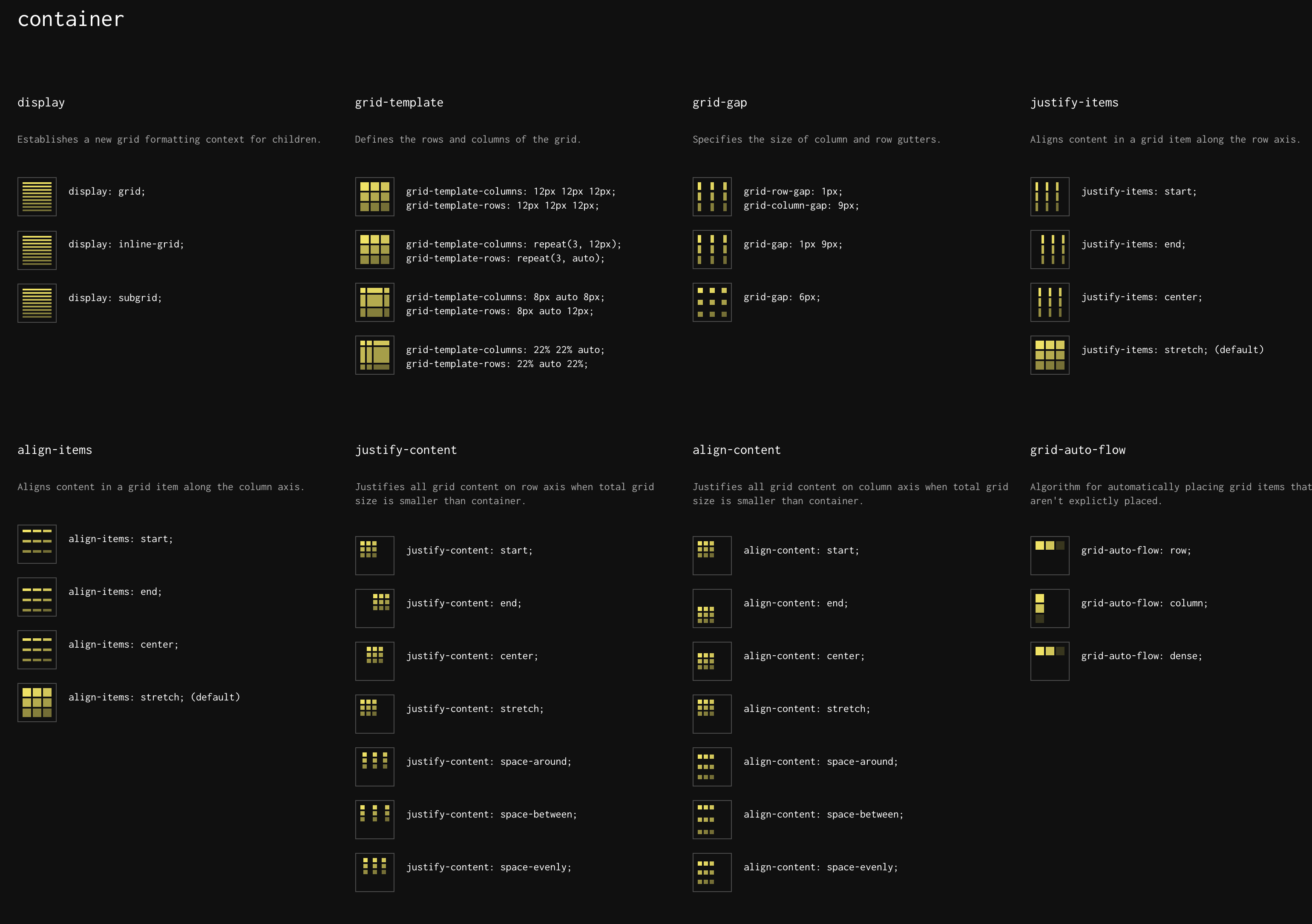
- Grid一些属性缩写:
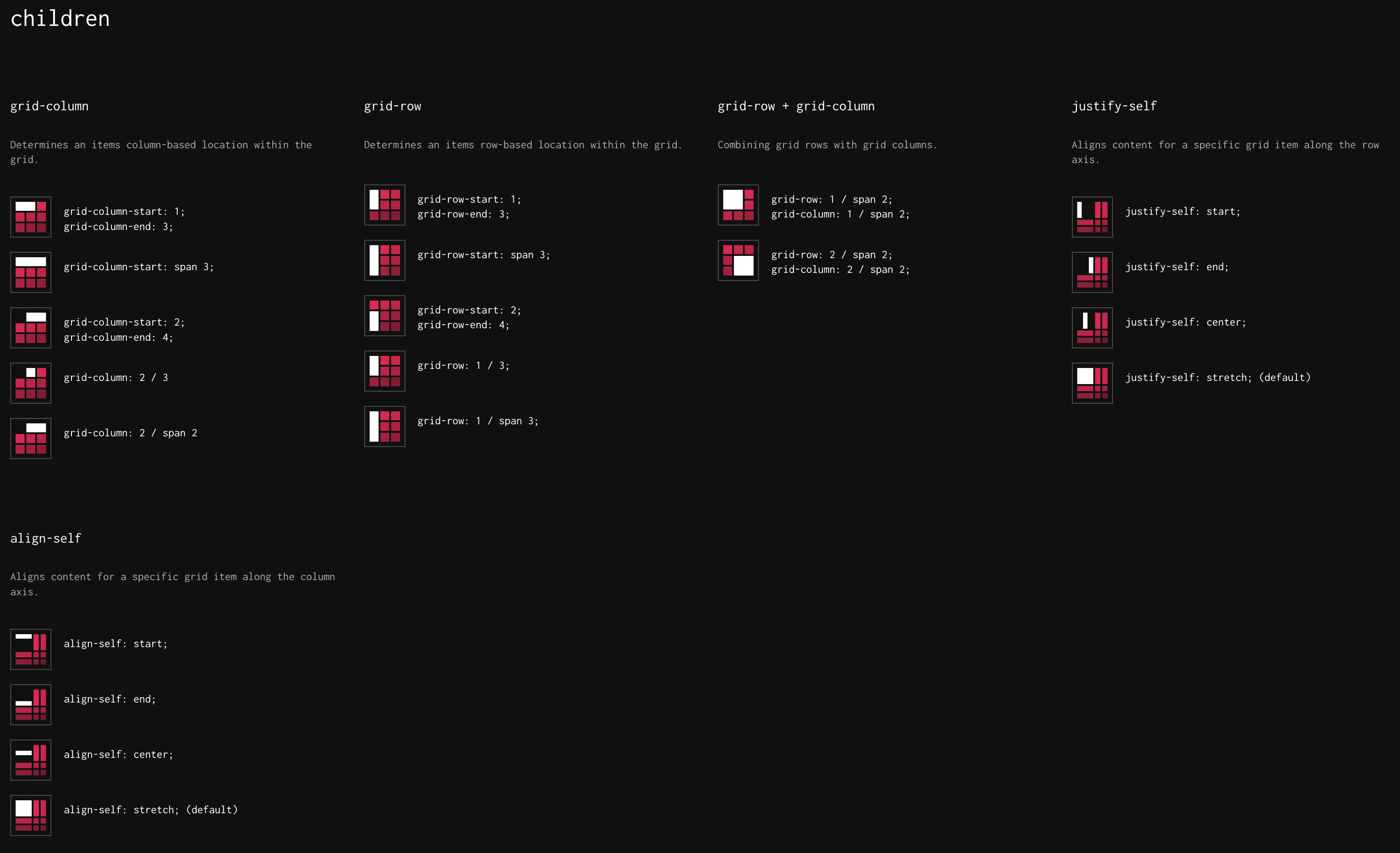
grid-gap: 100px 1rem;: 等价于grid-row-gap: 100px;&grid-column-gap: 1rem;。如果只写一个值,则表示row和column gap相同,即grid-gap: 16px;等价于grid-row-gap: 16px;&grid-column-gap: 16px;grid-row: 2;等价于grid-row-start: 2;&grid-row-end: 3;grid-row: 1 / 3等价于grid-row-start: 1;&grid-row-end: 3;grid-row: 1 / span 3等于于grid-row-start: 1;&grid-row-end: 4;其中span表示横跨多少rowsgrid-area: 2 / 2 / 3 / 3依次表示grid-row-start / grid-column-start / grid-row-end / grid-column-end
- 隐式Grid,当Items项数量超过Grid规定的单元格数时:
grid-auto-flow默认为row,即垂直方向的填充,还可以定义grid-auto-rows: 140px;表示下个填充的rows的高度。- 可以设置
grid-auot-flow: column;即水平方向填充,还可以定义grid-auto-columns: 1fr;表示填充的宽度为容器剩余宽度的1fr。
justify-content: 表示当整体grid尺寸小于容器尺寸时,水平方向如何防止Itemsjustify-items: 沿行轴(即水平)对齐网格项中的内容,注意和上面的justify-content的区别🚨justify-self: 表示单个Item,自身沿水平方向怎么对其grid cell
- Grid一些属性缩写:
🚀🚀 A Complete Guide to CSS Grid 这个是对上面教程的补充,更加的完整,其图形表示更加的清晰,必看🔥
包含所有属性的完成语法😎
place-self可同时设置<align-self> / <justify-self>比如place-self: center stretch表示align-self: center;(即单元格内垂直方向居中) &justify-self: stretch;(即单元格内水平方向拉伸填充)place-items可同时设置<align-items> / <justify-items>这2个属性和flexbox中的align-items&justify-content是一样的。比如place-items: center;表示align-items: center;&justify-content: center;place-content可同时设置<align-content> / <justify-content>这2个属性,它们都表示当整体大小小于grid容器大小时,整体的摆放方式。比如place-content: start end;表示align-content: start;(垂直方向) &justify-content: end;(水平方向)grid-template可同时设置<grid-template-rows> / <grid-template-columns>。 比如grid-template: 40% 60% / 200px 1fr;等价于grid-template-rows: 40% 60%;&grid-template-columns: 200px 1fr;流式布局代码片段:
css.grid-container { display: grid; /* minmax(200px, 1fr) 表示最小200px,最大 1fr */ grid-template-columns: repeat(auto-fill, minmax(200px, 1fr)); /* 对于小屏幕,可以使用下面方式: min(200px, 100%) 表示 200px和 100%去更小的值 */ /* grid-template-columns: repeat(auto-fill, minmax(min(200px, 100%), 1fr)); */ gap: 1rem; }包含其余一些关于Grid相关的教程和资源🔥
🚀🚀 Grid By Example 包含Grid相关大量的示例和视频,以及图解,必看🔥
💯 CSS Grid Garden 通过游戏的方式学习Grid属性
The CSS behind Figma - @ishadeed.com 介绍了Figma中如何使用Flexbox & Grid进行布局的
工具
- Grid Cheatsheet online 通过各种按钮选择,来理解grid属性的用法,包含所有属性语法
- CSS Grid Generator 在线边界Grid格子,然后生成代码
- Grid.layoutit 这个也是在线生成代码,比上面的功能更强大一些😎
2022年12月27日15:35:45