 Awesome Graph
Appearance
这是 A Guide to SVG Animations (SMIL) 的部分内容2。
4️⃣ ⭐ xlink:href 指定动画目标
无论你使用4种动画元素(<animate> & <set> & <animateMotion> & animateColor)中的哪一种,你都需要指定动画的目标。
为了指定目标,你可以使用 xlink:href 特性。该属性接受一个指向此动画目标元素的URI引用,该元素将随着时间的推移而被修改。
WARNING
目标元素必须是当前SVG文档片段的一部分。
html
<rect id="cool_shape" ...="">
	<animate xlink:href="#cool_shape" ...=""></animate>
</rect>
如果你使用嵌套的语法,也可以忽略 xlink:href,它会直接寻找当前动画元素的父元素,即上面可写为:<animate>动画元素也会对父元素 <rect> 进行动画
js
<rect id="cool_shape" ...="">
  <!-- 嵌套的形式可以省略 xlink:href -->
	<animate  ...=""></animate>
</rect>
如果你想把动画和文档分开则必须使用 xlink:href 特性:
xml
<svg>
  <rect id="cool_shape" ...="">
  </rect>

	<!-- 在别的地方对rect元素进行动画 -->
  <animate xlink:href="#cool_shape" ...=""></animate>
</svg>
5️⃣ attributeName & attributeType 指定动画属性
所有动画元素都共享一个特性:attributeName - 用于指定要动画的特性的名字。
- 🌰 比如你要对
<circle cx="100" ...>元素进行X轴方向的移动动画,则可以指定为attributeName="cx"
WARNING
attributeName 一次只能接收一个值,而不是一个列表或者数组,因此如果你想对多个特性进行动画,则需要给该元素定义多个动画。这也是SMIL动画不如CSS动画方便的地方😅。
📚 当你指定一个特性名时,你可以添加一个 XMLNS (XML 简写) 前缀,表明该特性的命名空间。命名空间也可以通过 attributeType 指定:
一些特性属于CSS命名空间(这也以为着该特性 也 可以在CSS属性中找到);而一些特性是XML独有的,如下图:
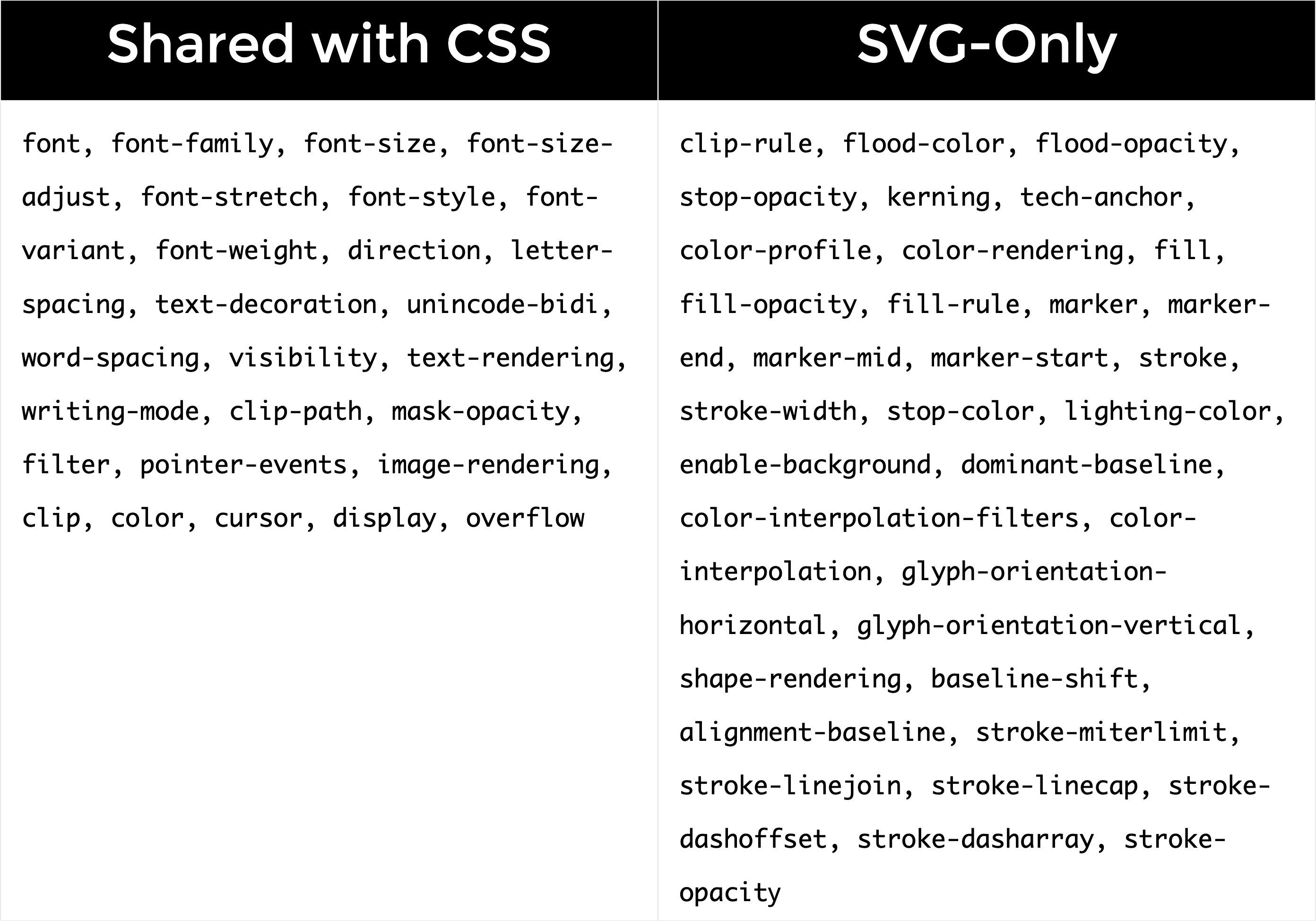
上图没有列举出所有的SVG特性,只是可以使用CSS设置的一些特性。它们中有些已经作为CSS属性可以访问到了。
TIP
如果没有显式的设置 attributeType 或者将其设置为 auto,浏览器首先会对CSS属性列表进行搜索匹配,如果没有找到,再去默认的XML名称空间中搜索元素。
🌰 下面对SVG矩形的 opacity 进行动画,因为 opacity 特性也可以作为CSS属性使用,下面的 attributeType 设置为 CSS命名空间:
html
<rect>
  <animate
   attributeType="CSS"
   attributeName="opacity"
   from="1"
   to="0"
   dur="5s"
   repeatCount="indefinite"
  ></animate>
</rect>
INFO
下面对其它动画特性进行介绍,除非特殊说明,所有的动画特性都是对所有动画元素都是通用的。
6️⃣ from, by, to, begin, dur, fill 特性 ⭐
我们先将一个圆从一个地方水平移动到另一个地方,即改变 cx 特性的值。这个元素一次对一个特性进行动画。💡 一般接收数字类型或者颜色的特性都是可以进行动画的。
为了添加动画,一般会使用 from & to & dur 值。除了这些,为了指定动画什么时候开始,还会用到 begin 特性。
🌰:定义一个圆,从圆的中心从 50单位 沿着x轴移动到 450单位 位置 - SVG animate basic attributes - codepen
html
<circle id="my-circle" r="30" cx="50" cy="50" fill="orange">
  <animate xlink:href="#my-circle"
		attributeName="cx"
		from="50"
		to="450"
		dur="1s"
		begin="click"
		fill="freeze"
  >
  </animate>
</circle>
1️⃣
begin 的几种用法:
这里设置为了
click,表示当圆被点击后触发动画。也可以将其设置为时间值,比如
begin="0s",表示页面加载后就开始动画或者非0值,表示延迟开始动画
begin="2s",延迟2s后开始动画begin="click + 1s": 点击后等1s开始动画还可以使用其他值,用于同步动画,并且无需计算duration和动画延迟
2️⃣
dur 相当于CSS中的 animation-duration 表示动画时长
3️⃣
from & to 类似CSS中的 @keyframes 动画:
css
@keyframes moveCircle {
  from { /* 起始值 */ }
  to { /* 结束值 */ }
}
4️⃣
fill 类似于 animation-fill-mode 属性,用于指定元素是否应该在动画结束后返回初始状态(这个名字取得并不好,和svg中定义填充颜色同名了😅)。它的值也类似CSS属性值,只是名字不同:
freeze:停止动画结束为止。除非动画重新开始remove:动画效果被移除,元素回到起始位置
5️⃣
by 用于指定 相对偏移量。这个一般只有在离散步骤动画才用到,类似于CSS里面的 step() 函数工作方式:
- SVG中等同于
step()函数的是calcMode="discrete" - 使用叠加(
additive)和累计(accumulative)动画中有可能用到by
7️⃣ restart 重启动画
阻止动画被重新开始,当动画处于激活状态时。比如,当你点击一个圆,它开始运动,你再次点击圆时,它会重头开始动画,设置了这个值可以阻止这种行为:
always:动画任何时候都可以重新开始;这是默认值whenNotActive:只有当元素处于非激活状态时,才能重启动画;激活状态重启动画将被忽略never:不能重新开始动画
8️⃣ ⭐ 命名动画和同步多个动画
假设我们想在移动圆圈之后,再改变圆的颜色。我们一般可以将颜色改变的 begin 时间设置为移动圆的 dur 值。
但是,SMIL提供了一个非常强大的事件处理功能。我们之前提到的 begin="click + 5s" 值就被称为 事件值(event value),它是 [eventName] + [clockValue] 组成。有趣的部分是 [clockValue]:
- ClockValue 的语法 📔
- 可以写成
10min|01:33|02:30:03等格式
🤩 除了上面的写法外,begin 还支持ID引用的方式,这样可以很好的对多个动画进行编排,比如,下面的 blue-rectangle 在 orange-circle 开始后 1s 开始动画,可以写为:SVG animate begin写法 - @codepen
html
<svg width="500" height="350">
  <circle id="orange-circle" r="30" cx="50" cy="50" fill="orange" />
  <rect id="blue-rectangle" width="50" height="50" x="25" y="200" fill="#0099cc" />

  <animate xlink:href="#orange-circle"
           attributeName="cx"
           from="50"
           to="450"
           begin="click"
           dur="5s"
           fill="freeze"
           id="circ-anim"
           />
  <animate xlink:href="#blue-rectangle"
           attributeName="x"
           from="50"
           to="425"
           dur="5s"
           begin="circ-anim.begin + 1s"
           fill="freeze"
           id="rect-anim"
           />

</svg>
<p>点击圆开始动画,矩形1s后开始动画</p>
还可以在圆结束后开始矩形动画,使用 end 事件:
jsx
 <animate xlink:href="#blue-rectangle"
          attributeName="x"
          from="50"
          to="425"
          dur="5s"
          begin="circ-anim.end"
          fill="freeze"
          id="rect-anim"
        />
或者其他的组合:
jsx
 <animate xlink:href="#blue-rectangle"
          attributeName="x"
          from="50"
          to="425"
          dur="5s"
          begin="circ-anim.end - 3s"
          fill="freeze"
          id="rect-anim"
        />
9️⃣ 重复动画
9.1 repeatCount 重复动画
指定动画重复次数
repeatCount="2":表示重复2次repeatCount="indefinite":表示无限重复
🌰 重复圆圈2次 - SVG SMIL repeatCount attribute - @codepen
html
<animate
  xlink:href="#circle"
  attributeName="cx"
  from="50"
  to="450"
  dur="5s"
  begin="click"
  repeatCount="2"
  fill="freeze"
  id="circle-anim"
/>
可以发现重复的时候,动画会从 from 位置再次开始。
WARNING
不幸的是,SMIL没有像CSS那样的前进返回的效果(yoyo 效果)😅。CSS中有个 animation-direction: alternate 可实现 yoyo 效果。
如果SMIL要实现yoyo效果,则需要借助JS显式的改变 from & to 值,可参考 Jon McPartland 文章。
💡另一种解决方法是将结束值指定为中间值,然后使结束值与初始值相同。例如,你将 from & to 设置为相同值,然后设置一个中间值。CSS用 keyframes 的做法是:
css
@keyframes alternate {
  from, to {
    left: 0;
  }

  50% {
    left: 300px;
  }
}
📚 而SMIL则可以使用 values 特性,我们之后会讲到这特性。
也就是说,上述方法可能对你有用,也可能不适用,这取决于你想要的动画类型,以及你是否要链式动画、重复动画或累加动画。
这里有一个使用延迟开始时间的简单无限动画:Hexagon Ripple - @codepen
9.2 repeatDur 限制重复时间
将 repeat="indefinite" 会无限重复动画,这可能会有点无聊。我们可以通过 repeatDur 限制重复时间。时间从文档加载完开始计算,这个时间称之为 表现时间(presentation time)。它的语法类似 ClockValue 的语法。但是它是 相对于文档开始时间的,而不是相对事件
🌰 从文档开始后 1分30秒 后停止重复动画
html
<animate
  xlink:href="#circle"
  attributeName="cx"
  from="50"
  to="450"
  dur="2s"
  begin="0s"
  repeatCount="indefinite"
  repeatDur="01:30"
  fill="freeze"
  id="circle-anim"
/>
Live demo: SMIL repeatDur attribute - @codepen
WARNING
🚨 repeatDur 是从文档加载就开始计时的,如果下面代码,可能动画重复的次数和你想的不一样:
html
<animate
  xlink:href="#circle"
  attributeName="cx"
  from="50"
  to="450"
  dur="2s"
  begin="0s"
  repeatCount="indefinite"
  repeatDur="6s"
  fill="freeze"
  id="circle-anim"
/>
理想中动画时长 2s,重复 6s ,重复次数为 6/2 = 3 次,实际只会重复2次。
但如果你是通过 begin="click" 点击触发动画,则下面动画重复次数会得到保障:
html
<animate
  xlink:href="#circle"
  attributeName="cx"
  from="50"
  to="450"
  dur="2s"
  begin="0s"
  repeatCount="indefinite"
  repeatDur="7s"
  fill="freeze"
  id="circle-anim"
/>
重复次数 7/2 = 3.5 次,圆会在3.5次,停止动画中间。
9.3 依据重复次数同步动画
让我们再次回到同步动画这个话题上。在SMIL中,你可以让一个动画在另一个动画重复多少次之后再开始动画😎。
🌰 矩形在圆形重复2次动画之后,再开始动画,有点类似GSAP时间轴的概念:
html
<animate
  xlink:href="#rect"
  attributeName="x"
  from="50"
  to="450"
  dur="2s"
  begin="circ.anim.repeat(2)"
  repeatCount="indefinite"
  fill="freeze"
  id="rect-anim"
/>
还可以加上或者减去一些时间:圆重复2次,第2次结束前1s,矩形开始动画
html
<animate
  xlink:href="#rect"
  attributeName="x"
  from="50"
  to="450"
  dur="2s"
  begin="circ.anim.repeat(2) - 1s"
  repeatCount="indefinite"
  fill="freeze"
  id="rect-anim"
/>
还有一个 sync repetition demo
🔟 keyTimes&values 控制动画keyframes值
在CSS中你可以使用 @keyframes 控制动画属性,比如下面keyframes动画类似弹簧的效果:
css
@keyframes bounce {
  0% {
    left: 0;
  }
  50% {
    left: 320px;
  }
  80% {
    left: 270px;
  }
  100% {
    left: 300px;
  }
}
📚 通过百分比的形式描述动画路径。SMIL存在相同的方式,就是语法有所差异:
keyTimes指定特定keyframes,控制动画的节奏,使用小数的形式values指定对应keyframes上的值,使用这个特性后from&to特性会被忽略🚨🚨
所以上面的keyframes动画,在SMIL中的形式为:
html
<animate
  xlink:href="#circle"
  attributeName="cx"
  from="50"
  to="450"
  dur="2s"
  begin="click"
  keyTimes="0; 0.5; 0.8; 1"
  values="50; 490; 350; 450"
  fill="freeze"
  id="circ-anim"
/>
WARNING
如果只定义 values,而没有定义 keyTimes 特性,则动画为线性动画。
1️⃣1️⃣ calcMode & keySplines 自定义keyframes缓动函数
📚 CSS中可以通过指定的关键词和 贝塞尔曲线 函数指定缓动函数。在SMIL中控制动画节奏的特性是 calcMode,默认值是 linear (<animateMotion> 元素除外)。
除了 linear 值外,还有3个值:
discrete- 离散值,直接从一个值跳到另一个值,没有动画,类似CSS中的steps()函数paced- 类似于linear,但是它会忽略keyTimes定义的进度值。它计算出后续值之间的距离,并相应地分配时间。如果所有值都是线性顺序的,则不会注意到差异。但如果动画返回和前进,或者改变的是颜色值(颜色被当做是三维vector值),则你就可以觉察到中间值spline- splie的时间点通过keyTimes定义,值则是values,而keySplines则控制每一段之间缓动函数
对于 calcMode="spline" 还是以CSS做类比:
css
@keyframes bounce {
  0% {
    top: 0;
    animation-timing-function: ease-in;
  }
  15% {
    top: 200px;
    animation-timing-function: ease-out;
  }
  30% {
    top: 70px;
    animation-timing-function: ease-in;
  }
  45% {
    top: 200px;
    animation-timing-function: ease-out;
  }
  60% {
    top: 120px;
    animation-timing-function: ease-in;
  }
  75% {
    top: 200px;
    animation-timing-function: ease-out;
  }
  90% {
    top: 170px;
    animation-timing-function: ease-in;
  }
  100% {
    top: 200px;
    animation-timing-function: ease-out;
  }
}
📚上面我们每一小段的动画缓动函数都不同(通过 animation-timing-function 定义);SMIL中也可以定义每一段的缓动函数,但是它是通过 贝塞尔曲线的2个控制点进行定义的,比如:
ease-in=cubic-bezier(0.47, 0, 0.745, 0.715)ease-out=cubic-bezier(0.39, 0.575, 0.565, 1)
TIP
上面的可能不直观,可通过 Cubic-Bezier工具 来查看控制点
上面的CSS keyframes 用SMIL,可以写为:
html
<animate
  xlink:href="#circle"
  attributeName="cy"
  from="50"
  to="250"
  dur="3s"
  begin="click"
  keyTimes="0; 0.15; 0.3; 0.45; 0.6; 0.75; 0.9; 1"
  values="50; 250; 120; 250; 170; 250; 210; 250"
  calcMode="spline"
  keySplines="
    0.42 0 1 1;
    0 0 0.59 1;
    0.42 0 1 1;
    0 0 0.59 1;
    0.42 0 1 1;
    0 0 0.59 1;
    0.42 0 1 1
  "
  fill="freeze"
  id="circ-anim"
/>
可以看出 keyTimes 数量为 7;而 keySplines 定义的是2个keyTimes之间的缓动函数,因此它的数量为 6。
TIP
上面keySplines中的 0.42 0 1 1 的含义是贝塞尔曲线的2个控制点,第一个控制点为 (0.42, 0),第2个控制点为 (1, 1)
🌰 calcMode spline 定义各个动画段缓动函数 - @codepen
TIP
如果只想定义总体的缓动函数值,则只需要将 keyTimes 设置为 keyTimes="0; 1":
html
<animate
  xlink:href="#circle"
  attributeName="cy"
  from="50"
  to="250"
  dur="3s"
  begin="click"
  keyTimes="0; 1"
  values="50; 250"
  calcMode="spline"
  keySplines="
    0.42 0 1 1;
  "
  fill="freeze"
  id="circ-anim"
/>
1️⃣2️⃣ additive & accumulate 叠加和累积动画
有时候,定义一个从前一个动画结束的地方开始的动画是很有用的;或者使用前面动画的累计总和作为继续的值。为此,SVG有2个便利的特性:
additive- 指定from&to是否是相对于当前值;接收2个值"sum"- 相对动画特性原始值"replace"- 默认值;表示from&to将取代当前/原始值,可能导致动画开始时诡异的跳动😅
accumulate- 是否第2次重复动画的开始值,是第一次动画的结束值"sum"- 累积"none"- 重复动画从头开始
🌰1️⃣
假如你想增长一个元素的宽度;或者增加一条线段的长度;又或者你想让一个元素一步一步,从一个位置移动到另一个位置,通过分离的步骤。这个功能特别适用于 重复动画。
📚
就好像其它动画一样,你会设置 from & to,但是如果你将 additive 设置为 sum,则它们的每一个值都相对于动画属性的原始值。
以圆的动画为例,假设其 cx 初始为 50,设置 from="0" & to="100";0实际上是原来的50,100实际上是50 + 100;换句话说,这实际上相当于 from="50" to="150":😎
html
<svg width="500" height="100">
  <circle id="circle" r="30" cx="50" cy="50" fill="orange" />

  <animate
    xlink:href="#circle"
    attributeName="cx"
    from="0"
    to="100"
    additive="sum"
    repeatCount="3"
    calcMode="spline"
    keyTimes="0;1"
    keySplines=".42 0 1 1"
    dur="1s"
    begin="click"
    fill="freeze" />
</svg>
SVG SMIL additive attribute - @codepen
🌰2️⃣ 重复3次,这相当于动画从 50 -> 150 -> 250 -> 350
html
<svg width="500" height="100">
  <circle id="circle" r="30" cx="50" cy="50" fill="orange" />

  <animate
    xlink:href="#circle"
    attributeName="cx"
    from="0"
    to="100"
    additive="sum"
    accumulate="sum"
    repeatCount="3"
    calcMode="spline"
    keyTimes="0;1"
    keySplines=".42 0 1 1"
    dur="1s"
    begin="click"
    fill="freeze" />
</svg>
WARNING
accumulate 以下几种情况会被忽略:
- 动画的特性(比如
fill颜色填充)不支持累加 - 动画元素没有进行重复
- 只指定了
to特性,没有指定from特性
1️⃣3️⃣ end 指定动画结束条件
📚 除了通过 begin 指定动画的开始条件(或时间)外,还可以通过 end 指定动画结束的条件或者时间。
- 它接受和
begin一样的值,可以是一个绝对或者相对时间值,重复值,事件值等等 - 比如一个动画无限重复,但是可以当触发另一个动画的时候,将这个无限重复的动画终止
🌰1️⃣ 橘色圆动画时长30s,当点击绿色圆时,绿色圆开始动画,橘色圆动画会停止:SVG SMIL end 属性
html
<svg width="500" height="350">
  <circle id="orange" r="30" cx="50" cy="50" fill="orange" />
  <circle id="green" r="30" cx="50" cy="150" fill="green" />
  <animate
    xlink:href="#orange"
    attributeName="cx"
    from="50"
    to="450"
    dur="30s"
    begin="0s"
    end="greenAnim.begin"
    fill="freeze"
    id="orangeAnim"
  />
  <animate
    xlink:href="#green"
    attributeName="cx"
    from="50"
    to="450"
    dur="1s"
    begin="click"
    fill="freeze"
    id="greenAnim"
  />
</svg>
🌰2️⃣ 对同一个元素多个动画效果进行操作 - SVG SMIL end属性示例2
- 橘色圆动画效果1:颜色无限变化
- 同一个橘色圆动画效果2:当点击时,开始移动,同时结束动画1的效果
html
<svg width="500" height="100">
  <circle id="orange" r="30" cx="50" cy="50" fill="orange" />
  <animate
    xlink:href="#orange"
    attributeName="fill"
    from="#0099CC"
    to="deepPink"
    dur="5s"
    begin="0s"
    end="moveAnim.begin"
    repeatCount="indefinite"
    fill="freeze"
    id="colorAnim"
  />
  <animate
    xlink:href="#orange"
    attributeName="cx"
    from="50"
    to="450"
    dur="5s"
    begin="click"
    fill="freeze"
    id="moveAnim"
  />
</svg>
1️⃣4️⃣ 多组 begin + end 定义间歇性动画
📚 可以定义多组 begin + end 值,一个begin对应一个end值,这样形成 active & inactive 间隔动画。
- 可以理解为一辆移动的小车,车的轮子间歇性的转动和不转动,取决于小车是否在移动
- 可以对小车创建多个动画效果,一个移动小车,一个旋转轮子,旋转动画和移动动画可以进行同步
🌰 矩形依据定义的多组begin + end值,间歇性的旋转,动画4次 - SVG SMIL间歇性动画效果
0s - 2s2s旋转360° 第一次动画5s - 8s3s旋转360°,第2次动画等第一次动画结束后3s(5s - 2s)开始9s - 15s6s旋转360°,第3次动画等第2次动画结束后1s(9s - 8s)开始17s - 25s8s旋转360°,第4次动画等第3次动画结束后2s(17s - 15s)开始
html
<svg width="500" height="150">
  <rect id="rect" width="50" height="50" x="50" y="50" fill="deepPink" />
  <animateTransform
    xlink:href="#rect"
    attributeType="XML"
    attributeName="transform"
    type="rotate"
    from="0 75 75"
    to="360 75 75"
    dur="2s"
    begin="0s; 5s; 9s; 17s;"
    end="2s; 8s; 15s; 25s;"
    fill="freeze"
    restart="whenNotActive"
  />
</svg>
WARNING
即使将 repeateCount="indefinite" 无限动画,它会被多组 begin + end 覆盖。
1️⃣5️⃣ min & max 限制动画时间
📚 min & max 限制动画激活时长。
- 之前介绍过
dur&repeatDur,如果和它们一起使用,它们之间的限制规则是什么呢? - 浏览器会依据
dur&repeatCount&repeatDur&end定义的值计算 激活时长,然后再对min&max做比较:- 如果计算的时长 大于
max,则激活时长最后取max值 - 如果小于
min,则激活时长取min值- 如果元素的重复持续时间(或者如果元素不重复则为简单持续时间)大于min,则元素在活动持续时间(min受限)内正常播放
- 否则,元素将在其重复持续时间内正常播放(如果元素不重复则为简单持续时间),然后根据
fill属性的值冻结或不显示
- 如果计算的时长 大于
2022年11月11日19:22:38